Vivat company is rebranded!

Changes are integral part of development. Moving forward, we are improving, renewing. We are always aware of new trends and current challenges of our time
In 30 years, Vivat company turned from just distributor to the developer and leading supplier of stationery and textile products. We have changed. First, we have changed internally: structure and activity. Now we have changed externally by updating the brand corporate style. Meet: renovated Vivat!


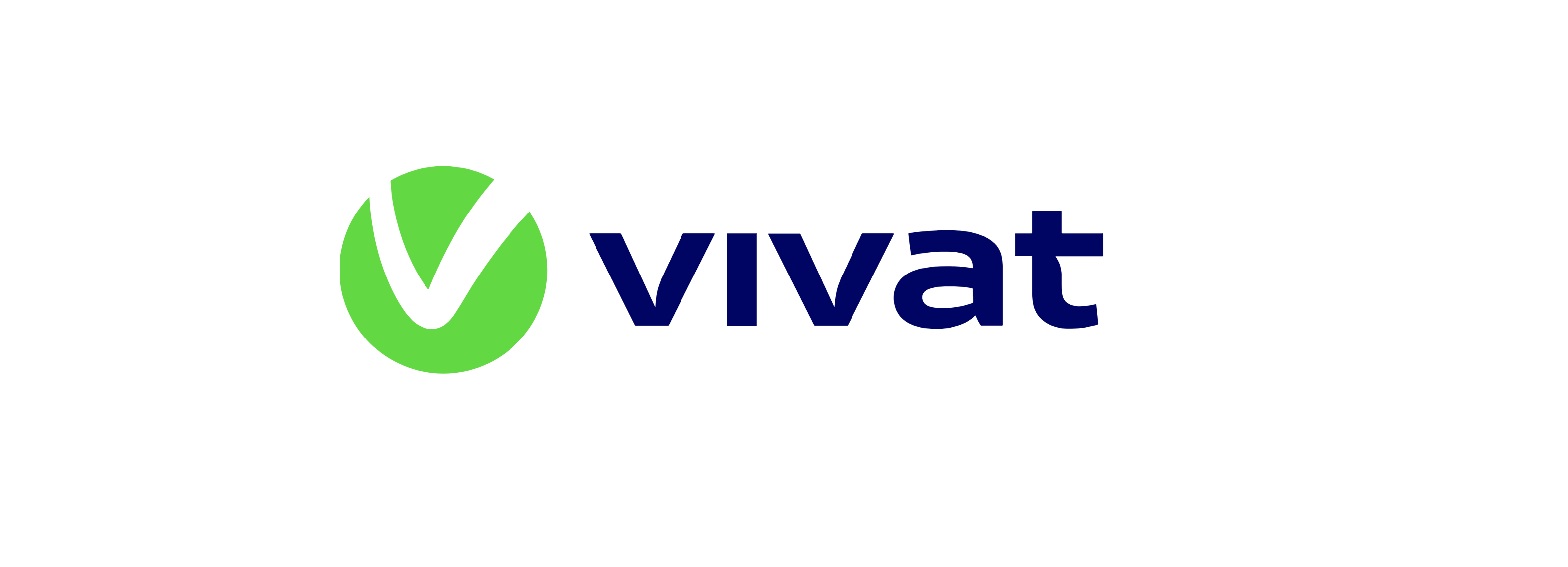
Today Vivat is a reliable and dynamic company. The symbolism of the new corporate style means following:
• Deep blue color emphasizes the company’s reliability, convenience and speed.
• Asymmetric letter “t” means the company moves forward.
• Round logo sign – direction towards digitalization, in the application shortcut style.
• Bright green color – modernity, style and development.
• Stylized letter “V” – choice, approval, flexibility, growth after trials, moving forward.
Renovated Vivat is the result of professional development, many years’ work and self-improvement.
Latest news
Subscribe to the news
Maybe we have something in common. Here are the main highlights about VIVAT.


